
THE COLOR OF CANNABIS By David A. Paleschuck, MBA, CLS
How Cannabis Brands Use Color To Educate, Evoke Emotion & Convey Efficacy By David A. Paleschuck, MBA, CLS
93 percent of shoppers make purchase decisions based on color and visual appearance. With a statistic like that, cannabis brand owners are spending time and money selecting the right colors for their logos, packaging, websites, and other brand assets in the race for your attention – the cannabis consumer.
The Science Behind Color and Emotion
Color resonates with people in different ways. We all have a favorite color or colors. That said, the color used by your favorite brands say a lot about the brand itself. The science behind our emotional connections to color is a complicated one. But it is becoming clear through anecdotal knowledge and scientific experimentation.
Is it possible that our brains are wired to like (or dislike) certain colors? It all relates to emotional responses when we see (a) color. A study by Wellesley College researchers Stoughton and Bevil Conway links neural processes to color.
The study further relates some of the things we already know – color context changes based on other colors in the field of vision and that emotion is a big factor when thinking about color

Color Impacts Intuition
The research into color is not a new phenomenon. It can be traced to works that are hundreds of years old. One of the most relevant today remains “Theory of Colors” by Johann Wolfgang von Goethe, which was first published in 1810. While this was not a “scientific work” per se, it set the course for much of what we know about color and the basis for future research.
Goethe published one of the first color wheels and associated color with more than hue; he also showed psychological impact. His theory about how color impacts our emotions and thoughts is still widely used and applies to how we think about color. The book is a great read for anyone with an interest in color theory. Here are some of Goethe’s color specific highlights:
Red: “The effect of this color is as peculiar as its nature. It conveys an impression of gravity, and at the same time of grace and attractiveness. … History relates many instances of the jealousy of sovereigns with regard to the quality of red. Surrounding accompaniments of this color have always a grave and magnificent effect.”
Yellow: “In its highest purity it always carries with it the nature of brightness, and has a serene, gay, softly exciting character. … State is agreeable and gladdening, and in its utmost power is serene and noble, it is, on the other hand, extremely liable to contamination.”
Blue: “As a hue it is powerful — but it is on the negative side, and in its highest purity is, as it were, a stimulating negation. Its appearance, then, is a kind of contradiction between excitement and repose. … As the upper sky and distant mountains appear blue, so a blue surface seems to retire from us.”
Green: “If the two elementary colors [yellow and blue] are mixed in perfect equality so that neither predominates, the eye and the mind repose on the result of this junction as upon a simple color. The beholder has neither the wish nor the power to imagine a state beyond it.”
The truth of the matter is that color is too dependent on personal experiences to be universally translated to specific feelings. Research shows, it's likely because elements such as personal preference, experiences, upbringing, cultural differences, context, etc., often muddy the effect individual colors have on us.
But there are broader messaging patterns to be found in color perceptions. For instance, colors play a fairly substantial role in purchases and branding. In an appropriately titled Study called “Impact of Color in Marketing”, researchers found that up to 93% of snap judgments made about products can be based on color alone - depending on the product.
And in regards to the role that color plays in branding, results from studies such as “The Interactive Effects of Colors” show that the relationship between brands and color hinges on the perceived appropriateness of the color being used for the particular brand.
The Study “Exciting Red and Competent Blue” also confirms that purchasing intent is greatly affected by colors due to the impact they have on how a brand is perceived. This means that colors influence how consumers view the "personality" of the brand in question.
Additional studies have revealed that our brains prefer recognizable brands, which makes color incredibly important when creating a brand identity. It has even been suggested in the Study, “Color Research & Application” that it is of paramount importance for new brands to specifically target logo colors that ensure differentiation from entrenched competitors (if the competition all uses blue, you'll stand out by using purple).
When it comes to picking the "right" color, research has found that predicting consumer reaction to color appropriateness in relation to the product is far more important than the individual color itself.
Certain colors do broadly align with specific traits – brown with ruggedness, red with excitement, etc. Nearly every academic study on colors and branding will tell you that it's far more important for a brand's colors to support the personality it wants to portray, instead of trying to align with stereotypical color associations.
“The specific colors used in a company’s logo have a significant impact on how that logo, and the brand as a whole, is viewed by consumers,”

Logo Color Affects Consumer Habits
“The specific colors used in a company’s logo have a significant impact on how that logo, and the brand as a whole, is viewed by consumers,” according to a study conducted by researchers at the University of Missouri-Columbia. The Study found specific links and ties to colors within logos and how people felt about those brands.
The findings change some of the ideas that we associated with specific colors. “Of all the feelings associated with logo colors, the feelings associated with red logos were the most surprising,” said a researcher. “Traditional emotions based on red include aggression and romance, but red logos did not invoke those emotions in study participants. This can probably be attributed to the fact that red is used in logos of many well-established brands such as State Farm®, McDonalds® and Coca-Cola®, so consumers have pre-existing emotions associated with brands using that color.”
Beyond Red, Yellow & Green
How are cannabis brands using color in their logos and marketing materials to differentiate themselves from the crowd? While many have followed the expected and stereotypical path, others have consciously thought through their color palette, brand essence and strategy.
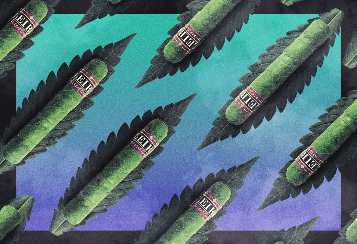
Not surprising, is that most new cannabis brands use blue and green tones & shades more than any other colors. Some brands – such as Mary’s Medicinals™ – intentionally use black & white exclusively to differentiate themselves. Others use visual cues and anchors that we associate with the history of cannabis such as tie-dye or the red, yellow & green of Rastafarianism.
More typical uses of color are in the scales defining indica versus sativa used to denote the efficacy of a cannabis strain. Typically, colors span from dark greens, blues & purples on the indica side – to – yellows, oranges & reds on the sativa side, representing the restful, mellowing affects of indica strains and the uplifting, energetic results from sativa strains.
Conclusion
Mixing color, science and emotion can be a tricky game. And while science is teaching packaging designers & consumers more every day, it’s also opening up more questions about how we see and feel about color – and accordingly the brands that use certain colors to convey their brand essence.
If the data is correct, brands will continue to use color to appeal to its consumers’ desires, as well as conscious & unconscious affinities.
There are four psychological primary colors - red, blue, yellow and green. They relate respectively to body, mind and emotions - and the balance between the three. The psychological properties of the eleven basic colors are as follows
1. RED:
· Positive: Physicality, courage, strength, warmth, energy, excitement.
· Negative: Defiance, aggression, visual impact, strain.
Being the longest wavelength, red is a powerful color. Although not technically the most visible, it has the property of appearing to be closer than it is and therefore grabs our attention first. Hence its effectiveness in traffic lights and stop signs universally. Its effect is physical; it stimulates us and raises the pulse rate, giving the impression that time is passing faster than it is. It relates to the masculine principle and can activate the "fight or flight" instinct.
2. BLUE:
· Positive: Intelligence, trust, efficiency, serenity, logic, reflection, calm.
· Negative: Coldness, aloofness, lack of emotion, unfriendliness.
Blue is the color of the mind and is essentially soothing; it affects us mentally, rather than the physical reaction we have to red. Strong blues will stimulate clear thought and lighter, soft blues will calm the mind and aid concentration. It is serene and mentally calming. It is the color of clear communication. In research, blue trends as the world's favorite color. However, it can be perceived as cold, unemotional and unfriendly.
3. YELLOW:
· Positive: Optimism, confidence, self-esteem, friendliness, creativity.
· Negative: Irrationality, fear, emotional fragility, depression, anxiety.
The yellow wavelength is relatively long and stimulating. In this case the stimulus is emotional, therefore yellow is the strongest color, psychologically. The right yellow will lift our spirits and our self-esteem; it is the color of confidence and optimism. Too much of it, or the wrong tone in relation to the other tones, can give rise to fear and anxiety.
4. GREEN:
· Positive: Harmony, balance, love, reassurance, equilibrium, peace.
· Negative: Boredom, stagnation, blandness, enervation.
Green strikes the eye in such a way as to require no adjustment whatever and is, therefore, restful. Being in the center of the spectrum, it is the color of balance - a more important concept than many people realize. When the world about us contains plenty of green, this indicates the presence of water, so we are reassured by green, on a primitive level. Negatively, it can indicate stagnation and, incorrectly used, will be perceived as being too bland.
5. VIOLET:
· Positive: Spiritual awareness, vision, luxury, authenticity, truth, quality.
· Negative: Introversion, decadence, suppression, inferiority.
The shortest wavelength is violet, often described as purple. It takes awareness to a higher level of thought, even into the realms of spiritual values. It is highly introversive and encourages deep contemplation, or meditation. It has associations with royalty and usually communicates the finest possible quality. Being the last visible wavelength before the ultra-violet ray, it has associations with time and space and the cosmos. Excessive use of purple can bring about too much introspection and the wrong tone of it communicates something cheap and kitschy.
6. ORANGE:
· Positive: Physical comfort, food, warmth, sensuality, passion.
· Negative: Deprivation, frustration, frivolity, immaturity.
Since it is a combination of red and yellow, orange is stimulating and reaction to it is a combination of the physical and the emotional. It focuses our minds on issues of physical comfort - food, warmth, shelter etc. - and sensuality. It is a 'fun' color. Negatively, it might focus on the exact opposite - deprivation. This is particularly likely when warm orange is used with black. Equally, too much orange suggests frivolity and a lack of serious intellectual values.

7. PINK:
· Positive: Physical tranquility, nurture, warmth, femininity, love, sexuality.
· Negative: Inhibition, emasculation, physical weakness.
Being a hue of red, pink also affects us physically, but it soothes, rather than stimulates. Pink is a powerful color, psychologically. It represents the feminine principle, and survival of the species; it is nurturing and physically soothing. Too much pink is physically draining and can be somewhat emasculating.
8. GREY:
· Positive: Psychological neutrality.
· Negative: Lack of confidence, dampness, depression, lethargy.
Pure grey is the only color that has no direct psychological properties. It is, however, quite suppressive. A virtual absence of color is depressing and when the world turns grey we are instinctively conditioned to draw in and prepare for hibernation. Unless the precise tone is right, grey has a dampening effect on other colors used with it.
9. BLACK:
· Positive: Sophistication, glamour, security, emotional safety, efficiency.
· Negative: Oppression, coldness, menace, heaviness.
Black is all colors, totally absorbed. The psychological implications of that are considerable. It creates protective barriers, as it absorbs all the energy coming towards you, and it enshrouds the personality. Black is essentially an absence of light, since no wavelengths are reflected and it can, therefore be menacing; many people are afraid of the dark. Positively, it communicates absolute clarity, with no fine nuances. It communicates sophistication and uncompromising excellence and it works particularly well with white. Black creates a perception of weight and seriousness.
10. WHITE:
· Positive: Hygiene, sterility, purity, simplicity, sophistication, efficiency.
· Negative: Sterility, coldness, barriers, unfriendliness, elitism.
Just as black is total absorption; white is total reflection. In effect, it reflects the full force of the spectrum into our eyes. Thus it also creates barriers, but differently from black, and it is often a strain to look at. White is purity and, like black, uncompromising; it is clean, hygienic, and sterile. The concept of sterility can also be negative. Visually, white gives a heightened perception of space.
11. BROWN:
· Positive: Seriousness, warmth, Nature, earthiness, reliability, support.
· Negative: Lack of humor, heaviness, lack of sophistication.
Brown usually consists of red and yellow, with a large percentage of black. Consequently, it has much of the same seriousness as black, but is warmer and softer. It has elements of the red and yellow properties. Brown has associations with the earth and the natural world. It is a solid, reliable color and most people find it quietly supportive - more positively than the ever-popular black, which is suppressive, rather than supportive.

About The Author:
With 15+ years of brand-building and consumer marketing experience serving American Express, MasterCard, PepsiCo and Microsoft, David has participated in developing and marketing many of today’s best-known brands. David’s career focus has been on brand strategy, brand development, brand management and integrated marketing. He has developed, activated and led comprehensive marketing programs designed to connect brands with relevant communities in consistent, credible, and meaningful ways. Since entering the cannabis industry in 2012, David has created profitable partnerships while working as the VP, Licensing & Brand Partnerships at DOPE Magazine and crafted award-winning cannabis-infused products as the Chief Brand Officer at Evergreen Herbal. David is perhaps best known for his writings and thought-leadership on cannabis branding and marketing. His writings have been featured in Forbes, Kiplingers, The Brookings Institution, The Green Report, Green Entrepreneur, Dope Magazine, High Times, PROHBTD, Cannabis Dispensary Magazine, MG, The Cannabis Industry Journal, A Different Leaf, Skunk Magazine, and New Cannabis Ventures, among others. David’s book, “Branding Bud: The Commercialization of Cannabis” – the first book on cannabis branding – released in April 2021 and ramped to be the best-selling book on Amazon in the “Branding & Logo Design” and “Green Business” categories.